Tuesday 4 December 2012

Cover page background!


1)                                    2)


3)                                    4)
5)


1) In this background I found a picture on the internet of burnt ripped paper then changed the colour on photoshop. This has been my favorite so I need to take my own photo soon and include it in :)

 2) I didn't think this background worked so well and it didn't fit my colour scheme and the main image looked to big in comparison to the size of the room.

3) In this background we took a photo of a brick from the internet so we can use the texture of it then I changed the colour of it  to fit the colour scheme on photoshop but I didn't really like the outcome. It also when quite blurry as the photo I used was to small however when I took my own photo I might not have had that happen.


Friday 23 November 2012

Masthead!- Front Cover Page

My masthead!
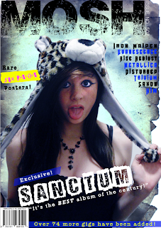
For my masthead I named it Mosh. I thought this would be a good name as moshing is associated with my genre of music. Its also short and catchy so the readers will remember the name. The font I chose is
distressed this links with the genre of music and is very eye catching.

I included the issue number to the side of the masthead I thought this looked professional and unique. 

Positioning the masthead:My orignal idea to place the masthead behind the image like in magazines such as Kerrang but I wanted  to try different positions to see which one looks 

Tuesday 20 November 2012

Photo shoot and Main Image!

Aims:
For my photo shoot im planning on taking a close up photo of someone with good eye contact, as I think its most effective and draws the reader in. The clothes I want them to wear is dark colors to fit my genre of music. However I might make them wear something such as a hat or necklace to include some color without effecting the image. 

Contact Sheet!
This is my contact sheet from my photo shoot!

Thoughts on the Photo shoot!

My chosen photo: ----------------------->   
I chose this photo as it was exactly what I was looking for as the eye contact is good and the style fits with my genre of music very well. The hat she's wearing is also quite unusual and stands out which would draw potential readers in. However I think theres to much shadow in the face so I'll edit it on photo shop and also get rid of the back ground. 


Editing the Photo!


On photo shoot I edited the curves to try and make less shadow and make it lighter in some places, mostly around the face. By using curves it allowed me target specific places I needed so I could still keep the sections dark where I wanted them to like the dress and her eyeliner. This helps keep the 'rock' theme I'm looking for. However I think this has made the face look slightly red so i'll play around with the colour balance and put a small amount of blues in to even it out.
While I was changing the colour balence I jogged and added more blue than I needed but I thought it made it look for eye catching and now im planning on changing my original colour scheme to fit with it. I orignally wanted the colour scheme to be white, black and red, but now im making it dark blues instead of red.

I've also deleted the background using magic wand too and I smoothed out the edges so it looks a lot neater.

Questionnaire Analysis

Mood Boards

This is my mood board, I've noticed that most of the colors used are quite dark and I will use this colour theme in my magazine. I also included the rock style in this mood board which will help me decide what I would like my main image to be wearing. The style is quite dark, mostly black, and most wear either skinnies or black leggings. There is also a lot of leather being worn in the rock style and theres usually studs on jackets, shoes and bags. In this mood board I had included some fonts as well and found out that most are distorted and edgy. This will be really important in my magazine as choice in fonts are a really important part of a magazine, especially on the front cover for example the masthead as it would make it easy for my target audience to link the magazine to rock music and draws them in.

Photoshop Lesson!